

Brand Strategy
Brand Identity
Illustration
Art Direction
Social Media
Event Signage
Merch Design
Print Design
Website Design
Well In
Project Details
Well In Immersive Wellness Festival
Well In is a multi-day wellness and yoga festival, currently hosted in Banff, Alberta. With a progressive approach to wellbeing, the experience emphasizes personal attention, communal connection, and the elemental power of nature. Facing growing competition in the wellness space and an evolving audience, Well In needed a brand that could express both its rootedness in nature and its future-forward spirit.
Our rebrand modernized the festival’s visual identity to attract a broader, more diverse audience – from first-time retreat-goers to seasoned practitioners seeking a deeper connection with nature. Built around the brand idea Journey Inward, the refreshed identity positions Well In as an immersive experience for those seeking transformation through movement, stillness, and nature. A retreat that nourishes you physically, mentally, and socially – guiding guests to be well, inside and out.
The new brand system is ironically systematic yet expressive. Bold, uplifting colours, modular typography, and unique imagery create a dynamic framework that flexes with the natural rhythm of the festival. Whether applied to wayfinding, social media, merchandise, or programming, the identity adapts seamlessly – making each touchpoint feel both intentional and alive.
The photography’s art direction highlights scenic landscapes, moments of mindfulness, and the warmth of community, reinforcing Well In as more than a wellness event – it’s a feeling, a presence, a pulse.


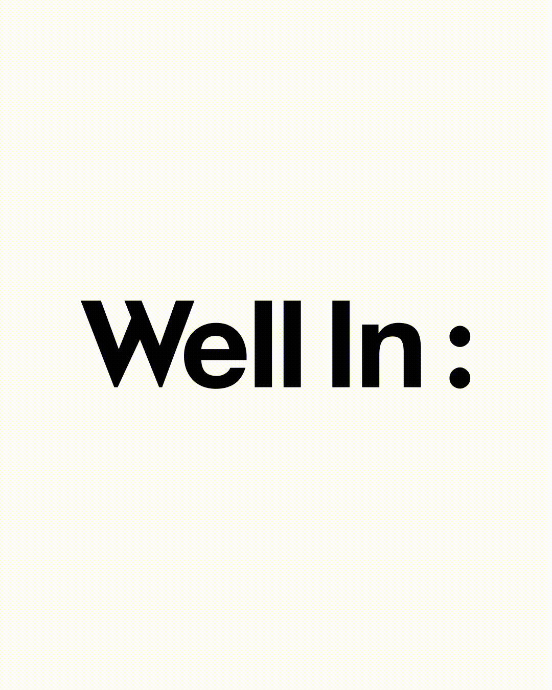
A Logo With Purpose
The new logo features a colon – a simple yet powerful symbol of anticipation. Acting as a visual and grammatical device, it introduces the festival’s many experiences: from movement sessions to shared meals to inspiring moments of reflection.

The Helvetica Neue wordmark is elevated by a bespoke “W,” referencing vintage Banff travel postcards and grounding the identity in its iconic location.

Original Logo
Feel Your Pulse
Inspired by Banff’s spring flora and fauna, we developed a set of custom illustrative motifs – each doubled to mirror the colon – bringing rhythm and vitality to the visual identity. These organic forms and repeated patterns add a sense of movement and play, subtly reinforcing the flow of breath, music, and nature.

Moving Mindfully
Typography is treated with intention – soft, fluid, and harmonious – shifting gently between expressions to reflect the openness and clarity at the core of the festival experience.


Well In:side and Out
Brand photography references themes of destination, seasonality, and wellness practices. Together, this cohesive system creates a visual world that invites guests into something deeper: a place to be fully present, fully connected, and fully well.

